
Welcome to “Did you know?” – our weekly series on practical digital ideas that help your business move.
Every week we’ll take one practical topic and make it simple: what it is, why it matters, and the tiny action you can take in under a minute. We’ll keep the focus on real outcomes – more enquiries, smoother UX, clearer content – and show how we approach the same problem in client work.
Expect short reads, checklists you can copy and further reading available. If you’ve got a question you’d like us to cover, message us at hello@e-innovate.co.uk and we can add it to the list!
This week’s focus: your homepage.
We’re looking at the simple tweaks that move people from interest to action. No heavy redesign. Just clearer next steps across the page.
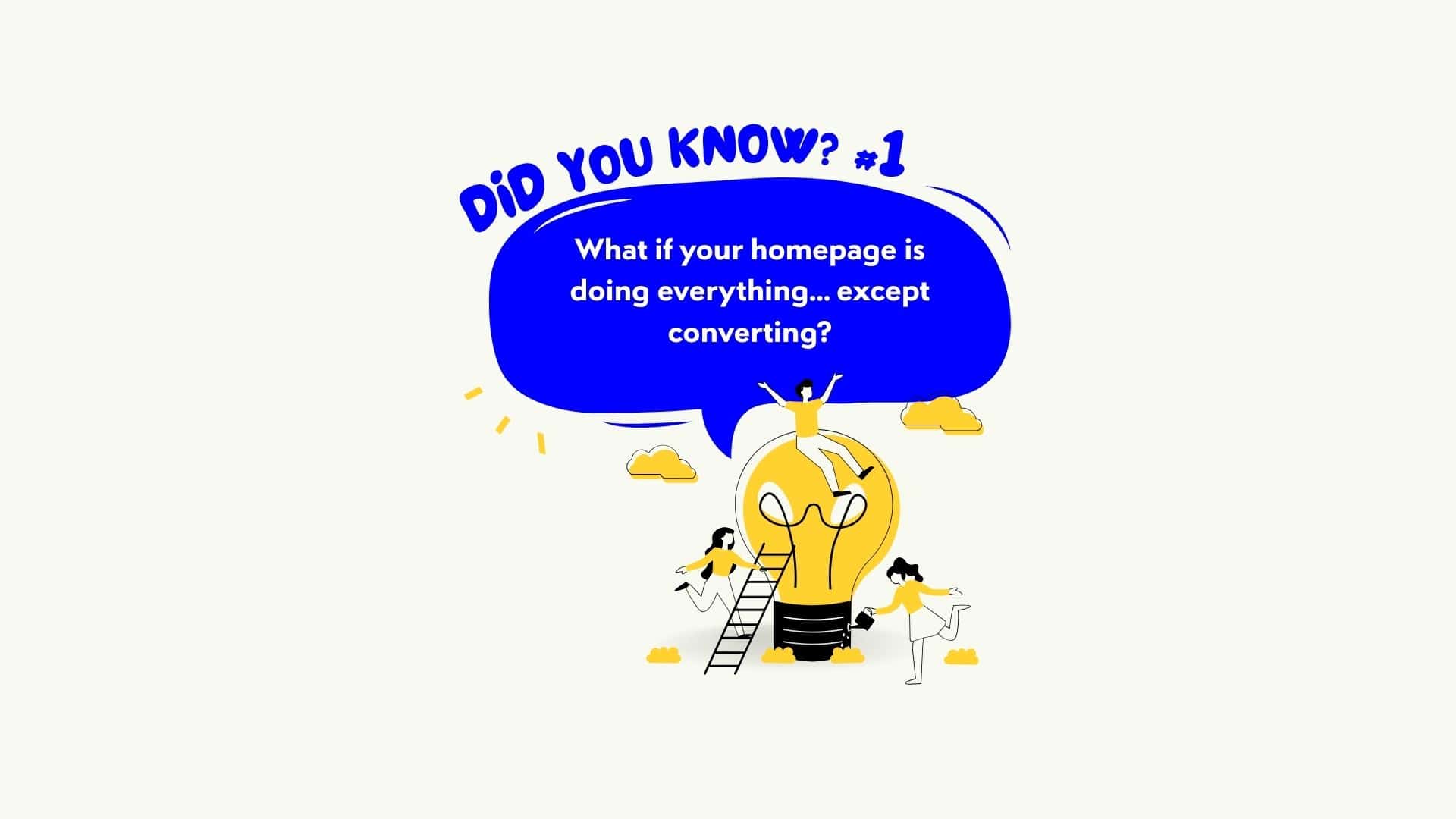
Some homepages try to be a showroom. The best ones act like a guide. They don’t just look good; they gently steer you from interest to action across the whole page. If your homepage has great content but no clear next steps, you’re inviting people to browse and bounce.
In plain English
A homepage isn’t one section. It’s a journey. Every scroll should answer two questions: what’s the next sensible step and where do I click to take it? That might be reading a case study, checking pricing, booking a call or starting a quote. You don’t need a big button in the hero to do this well. You need clear, consistent calls to action woven through the page so no one hits a dead end. Think of it like helpful signposts in a building. The welcome desk is useful, but the corridor signs are what keep you moving.
Why this matters for leads
People act when the path is obvious and low effort. A homepage with scattered or missing CTAs creates friction and doubt, even when the copy and design are strong. You lose warm prospects between sections, in the footer, or when they land on mobile and can’t see what to do next. Treat CTAs as part of service: make it easy to choose, easy to contact you and easy to keep momentum. Clarity and speed earn trust; trust earns enquiries.
What good looks like (quick checklist)
- Primary action in the navigation. Make the “contact”, “book a call” or “get a quote” route visible from every section via the header or a clear link in the first screen.
- CTA per section. Problem section → “See how we solve this.” Services teaser → “View [Service]”. Proof section → “Read the full case study.”
- Contextual CTAs, not generic ones. Match the action to the moment. After benefits, invite a demo. After pricing, invite questions.
- No dead ends. Every block should give a way forward. If a reader finishes a paragraph with nowhere obvious to go, add a link or button.
- Contact options that fit on mobile. Tap-to-call, short contact form, or a simple “email us” link. Big touch targets.
- Footer as a second chance. Repeat the primary action plus quick links to services, cases and contact.
- Proof near decisions. Place a short quote, logo row or stat close to CTAs so confidence rises where the click happens.
- Performance still matters. Slow pages reduce confidence. Keep assets lean so clicks feel instant.
60-second action
Open your homepage on your phone. Scroll once and say out loud the next sensible action at each section. If any section leaves you guessing, add or sharpen a CTA right there. Remove duplicate or competing CTAs that ask for different things in the same space.
What this looked like for a client
A B2B client had a strong homepage and no hero button. On paper, it matched their brand: confident, uncluttered. In practice, visitors read the first two sections and stalled. We added signposted CTAs through the journey: “See our work” under proof, “Compare options” under services, “Talk to a specialist” in the sticky header, and a short contact route in the footer. We placed a single testimonial beside the footer CTA and made tap-to-call visible on mobile. Nothing flashy. The effect was immediate: more people moved from reading to doing because the next step was always present and always made sense.
For the curious
Want a deeper look at what a high-performing site includes across design, UX and speed? Read our blog: What does a high-performing website actually look like?
FAQ’s
Do I need a big button at the top?
No. You need clear next steps throughout the page. A visible action in the header and contextual CTAs as people scroll are enough.
How many CTAs is too many?
Too many in the same place is confusing. One clear action per section is about right, with a consistent primary action available from anywhere.
Where should I place proof?
Near decisions. Place logos, a stat or a short quote close to CTAs so trust peaks at the click.
If you’d like a homepage that guides visitors from interest to action without the hard sell, explore our Website Design & Development service. We design for clarity, proof and speed across the whole journey.